IgniteNet which serves 200+ users from 50+ countries, including the US, Japan, and Thailand is taking a fresh approach to wireless and wired networks with a focus on simplicity, ease of use and performance.
IgniteNet Cloud Controller is a scalable wireless device management system, enables customers to monetize and secure their Wi-Fi networks, enable music streaming, setup up LTE backup, and many more. It has a powerful structure(3 levels structure: Cloud, Site, and Device) to help users manage a huge network.
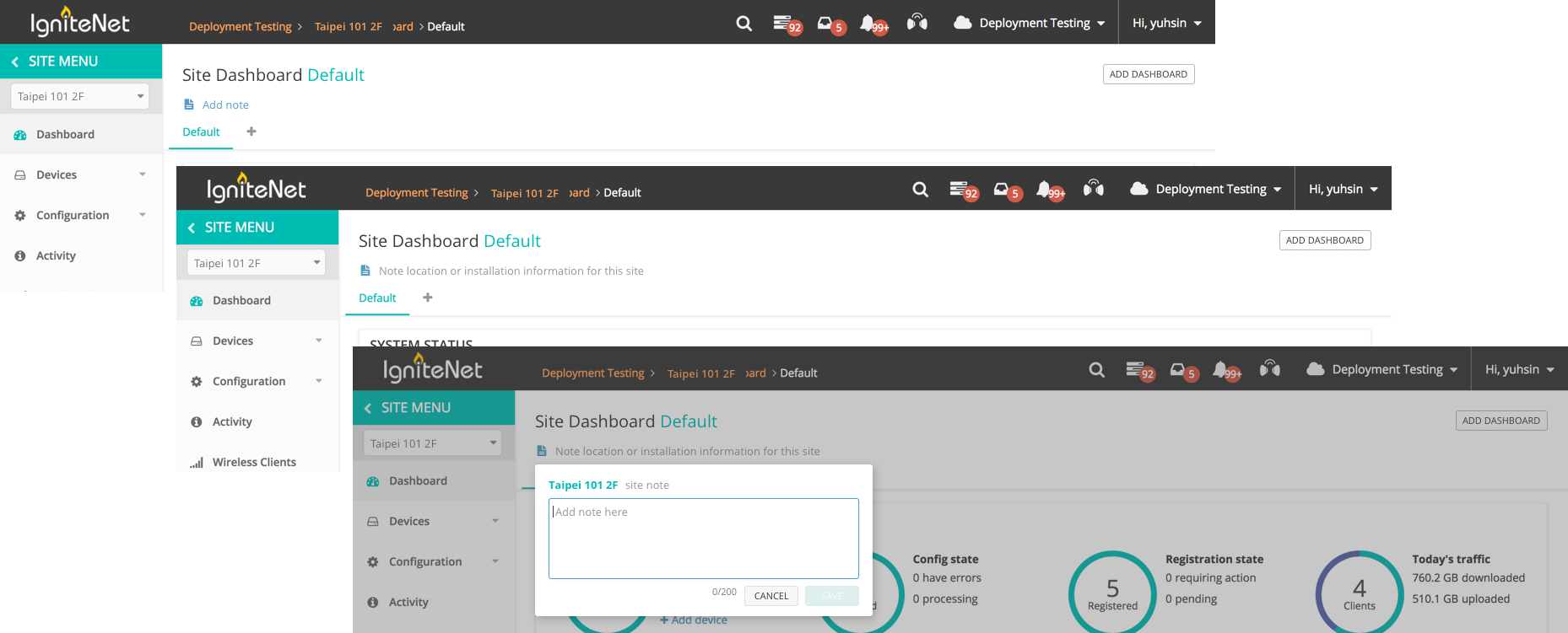
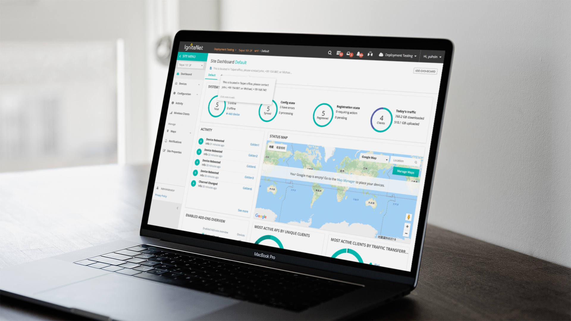
In this project, I designed a new feature "Add a note" which saves users' time. It allows users to add notes on the cloud so that they can check any work-related information on the cloud instead of looking for it on laptops or notebooks without efficiency.
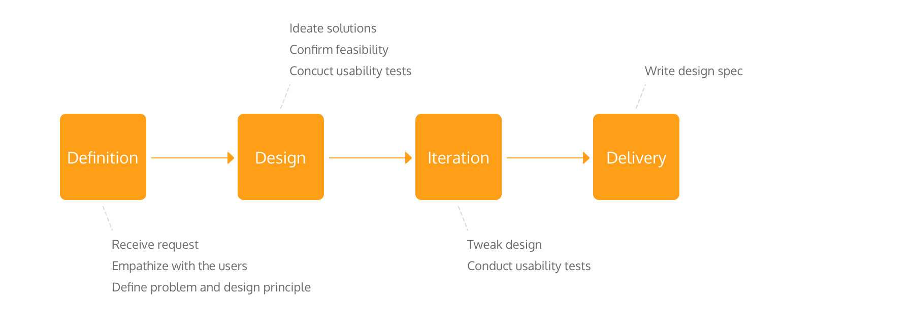
I was responsible for the whole design stage, from concepts to the final design solution and the design spec. I collaborated with the product owner and developers to design a simple way to solve users' problems and for developers, it didn't take much effort to deploy.
Most of our users are MIS, who work in ISP(Internet Service Provider) or WISP(Wireless Internet Service Provider) companies, manage the network for their clients, like schools, restaurants, hotels, and department stores.
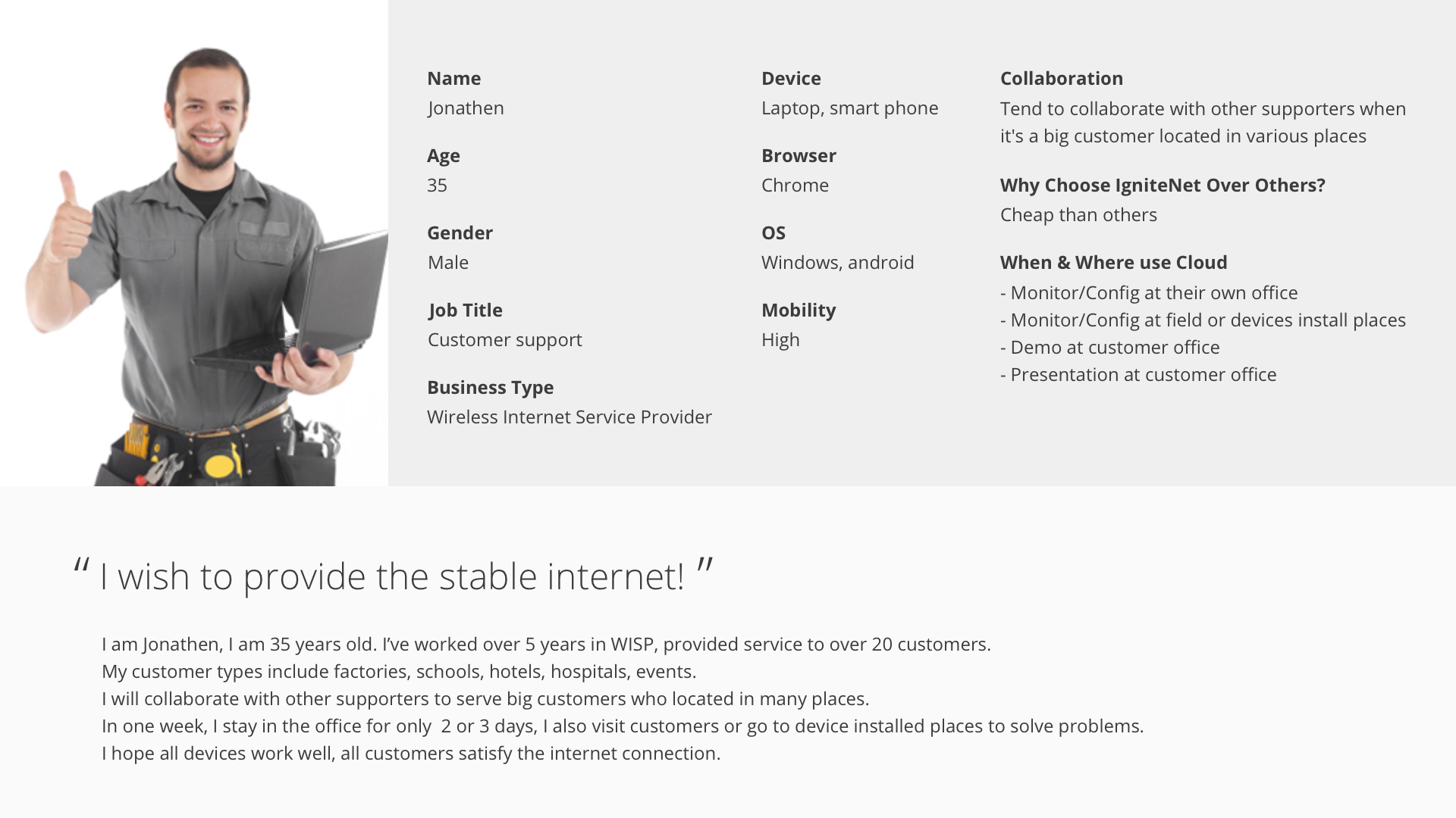
Based on the data collected through Google Analytics and the user interviews, generating the persona to help the team understand our users more so that we can design the product meets users' needs more.
According to the persona, I knew users' biggest goal is to provide stable internet and solve problems as soon as possible
I conducted Contextual Inquiry to learn more about users’ thought, feelings, their tools, who and how did they interact with. Through the reasearch, I defined the problem.
Users manage large network, they need to remember huge information to help them work, like the network settings, device locations. Users usually note them everywhere, such as write down in the notebooks or somewhere on the laptops. It wastes their time to look for what they need.
"As customer support, I need to remember much information to help me manage several huge networks so that I can maintain the network and solve issues in the shortest time"
Design a flexible and scalable way to help users enhance work efficiency in various scenarios.
Through persona, scenarios, and internal discussion, I defined the design principle: Flexible, Efficient, and Visible.
"How might we provide a "note" feature for users so that they can use it to remember work-related information in the cloud?"
The idea was to allow users to add notes in the cloud. In this way, they can finish work without switching many tools, it saves users' precious time.
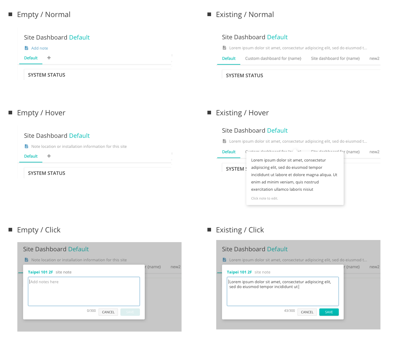
I designed many versions and made prototypes for Usability Tests. I gathered feedbacks from users and developers. To tweak the design to be more understandable, easy-to-use and less coding effort, I iterated the design based on the feedbacks.
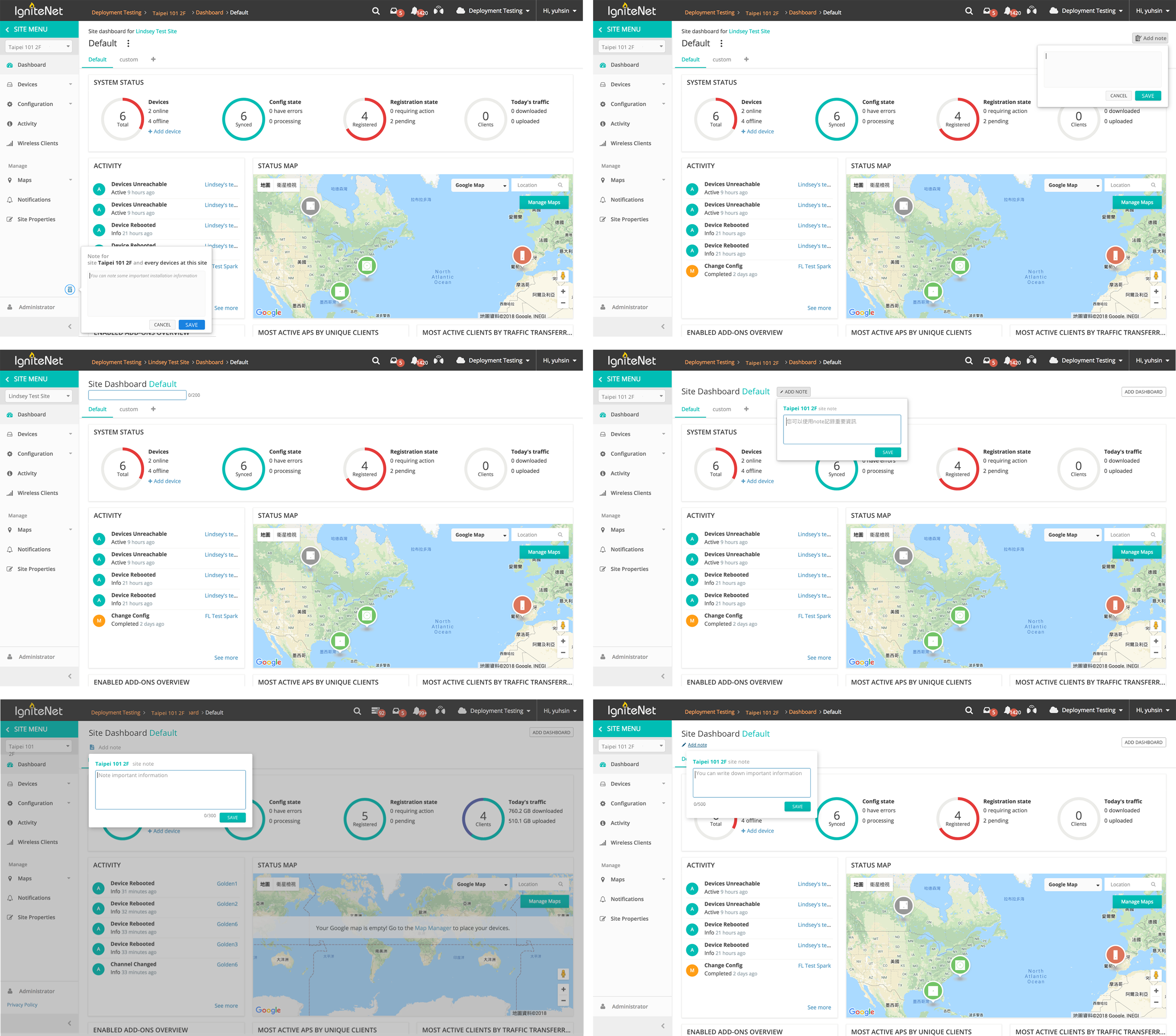
To contain any information users might note, I designed a simple input field. It didn't have any unnecessary element, anything in this input field was needed: the title is to remind users which site/device is the note for; the placeholder is to educate users how can they use; the buttons are for them to finish the task. In this way, it gives users the biggest flexibility, lowering the learning curve, and improving working efficiency.
I put the note at the header which is visible and easy to access, and used the defined secondary button style defined in the design system so that developers can deploy it quickly and kept system consistency as well. Since it's a new feature, users were not familiar with it, enhancing the consistency helped them know how to use it quickly.